Portfolio & Analytics
Portfolio Overview
The Hodly Portfolio brings your connected Base wallet positions, allocation, activity, Yield positions, and Accumulation plans into one dashboard.
Portfolio values are estimates based on available wallet balances, token prices, vault-share values, and indexed activity.
My Portfolio
The My Portfolio card shows:
- Estimated total wallet value
- Value and percentage change for the selected historical range
- Current asset allocation
- Token balances and estimated USD values
- Line and pie chart views
- Data freshness or refresh status when available
The pie view uses current positions with reliable USD prices. Tokens without a reliable price are tracked separately and are not used to create estimated allocation percentages.
Portfolio history
The line view shows estimated portfolio value over the selected historical range.
Available ranges include:
- 3D — available to signed-in users
- 7D
- 1M
- 3M
- All
Longer historical ranges require Core or Pro. Historical reconstruction may take time when a wallet or range has not been indexed previously.
Historical values depend on available balances, prices, and block data. Missing or unavailable observations are not replaced with the latest wallet state.
Accumulate plans
The Accumulate card displays saved Recurring Buy and Adaptive Accumulation plans.
Depending on the plan and available data, it may show:
- Target asset
- Current price and Risk Metric
- Next eligible purchase amount and date
- Budget progress
- Manual or automated status
- Permission readiness
- Latest automation skip reason
You can open a plan to review or edit its settings, complete a due manual purchase, manage automation, or delete the plan.
Yield positions
The Yield Earning card summarizes wallet-held vault positions.
Depending on available data, it may show:
- Vault and deposit asset
- Current position value
- Net APY
- Vault Health Score
- Historical position data
- Deposit, withdrawal, and manage actions
Yield values and APY are estimates and may change as vault share prices, rewards, fees, liquidity, and market conditions change.
Asset list
The Asset list shows priced wallet assets and available Hodly risk information.
Selecting an eligible asset opens its detailed Portfolio and Analytics view. Historical asset analytics require the applicable plan access.
Activity history
Activity History shows indexed wallet transactions such as:
- Token transfers
- Swaps
- Yield deposits and withdrawals
- Reward claims
- Accumulation purchases
Activity may take time to appear while Hodly indexes or refreshes wallet data.
Connected signed-out wallets can view a limited activity preview. Sign in to view the permitted history for the linked wallet.
Activity export
Eligible signed-in users can request a CSV activity export.
Core users can request the current calendar year. Pro users can request additional years or a supported custom year range.
Exports are prepared asynchronously and delivered through an expiring download link. They are informational records and should not be treated as tax or accounting reports.
Wallet scope
Portfolio data is scoped to the connected Base wallet.
Current allocation can be viewed without signing in. Protected history, plan, activity, and export features require a Hodly account and a wallet linked to that account.
Switching wallets changes the Portfolio data being displayed.
Important notes
- Portfolio values are estimates and may be delayed or incomplete.
- Token prices, vault-share values, and Risk Metric data can change.
- Assets without reliable pricing may not appear in the estimated total or allocation percentages.
- Historical reconstruction depends on available provider and blockchain data.
- Activity indexing may not include every transaction immediately.
- Portfolio performance does not include every fee, tax consequence, or external account.
- Hodly Portfolio is an educational and organizational tool, not financial, legal, accounting, or tax advice.
Portfolio & Analytics
Risk Metric
The Hodly Risk Metric is a 0–100 score that summarizes an asset's current market condition relative to its own history.
- Lower values indicate historically lower relative valuation and risk conditions.
- Higher values indicate historically elevated relative valuation and risk conditions.
A low score does not mean an asset is safe or cannot fall further. A high score does not mean its price must decline.
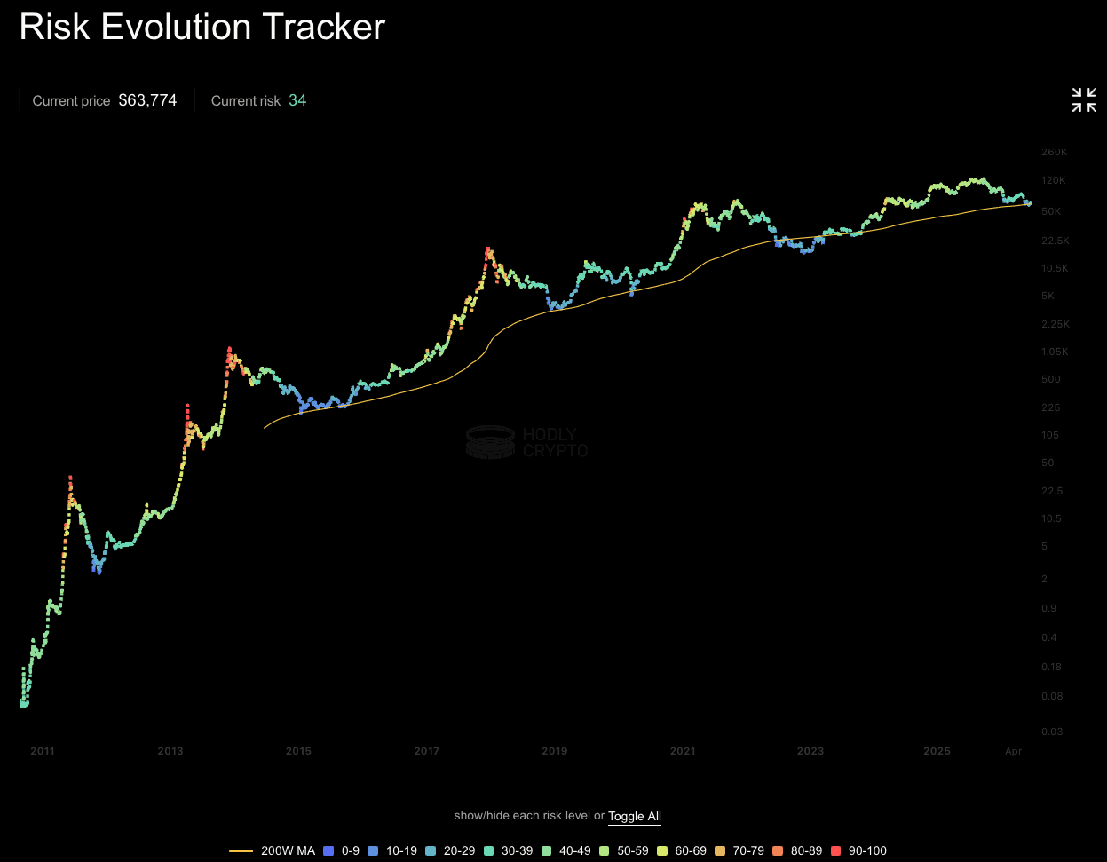
How Hodly calculates the Risk Metric
Hodly evaluates multiple categories of market data, including:
- Price behavior
- Momentum
- Volatility
- Long-term trend and relative market position
- Historical conditions for the same asset
Conceptually:
The model transforms and normalizes these inputs into a score between 0 and 100.
The exact formula, weights, transformations, parameters, and lookback periods are proprietary.
How to interpret the score
- Lower scores — historically lower relative-risk conditions
- Middle scores — less extreme relative conditions
- Higher scores — historically elevated relative-risk conditions
The score is intended for comparison across time. It is not a prediction of future price direction.
How Hodly uses it
The Risk Metric supports:
- Adaptive Accumulation
- Risk Stop evaluation
- Variable purchase sizing
- Risk Band Distribution
- Risk-Price Level analysis
- Backtesting and simulation
- Risk-change notifications
Important notes
- Model behavior and available history may vary by asset.
- Market data may be delayed, unavailable, or corrected.
- The metric does not capture every market, liquidity, regulatory, technical, or asset-specific risk.
- A low score does not guarantee a favorable purchase or prevent further loss.
- A high score does not guarantee a market decline.
- The Risk Metric is educational and is not financial advice.
Portfolio & Analytics
Risk Band Distribution
Risk Band Distribution shows how often an asset's historical Risk Metric fell within each 10-point range.
Each bar represents a band from 0–10 through 90–100:
- A taller bar means the asset historically spent more observations in that band.
- A shorter bar means the band was historically less common.
The distribution helps place the current Risk Metric in the context of the asset's own history. It does not predict future price direction or performance.
How to use it
Risk Band Distribution can help you:
- See whether the current Risk Metric is historically common or unusual
- Compare lower, middle, and higher relative-risk conditions
- Understand how often an Adaptive plan might historically have been eligible
- Evaluate the potential effect of different Risk Stop settings
- Identify how historical observations were distributed across risk conditions
The chart describes historical Risk Metric frequency. It does not directly measure asset volatility or the probability of profit or loss.
Risk Stop example
A Risk Stop of 70 allows an Adaptive plan to remain eligible when the current Risk Metric is 70 or below. The plan is ineligible when risk is above 70.
If historical observations above Risk 70 account for approximately 30% of the dataset, a Risk Stop of 70 would have been historically ineligible during approximately 30% of observations.
This is only an estimate. Actual scheduled execution frequency may differ because:
- The plan evaluates only on its selected schedule
- Historical risk frequency can vary by weekday or calendar date
- Current and future market behavior may differ from historical data
- Wallet balance, permission, quote, route, gas, and network conditions can prevent execution
How Hodly calculates the distribution
For each risk band b:
where:
- Nᵦ is the number of valid historical observations in risk band b
- N is the total number of valid historical Risk Metric observations
For example, the combined historical frequency above Risk 70 is:
Because Risk Stop 70 includes a score of exactly 70, the precise ineligible set is Risk greater than 70. Ten-point bands provide an approximation around that boundary.
Band boundaries
Hodly groups valid historical observations into these bands:
- 0 ≤ Risk < 10
- 10 ≤ Risk < 20
- 20 ≤ Risk < 30
- 30 ≤ Risk < 40
- 40 ≤ Risk < 50
- 50 ≤ Risk < 60
- 60 ≤ Risk < 70
- 70 ≤ Risk < 80
- 80 ≤ Risk < 90
- 90 ≤ Risk ≤ 100
Important notes
- The distribution is based on available historical Risk Metric observations.
- Missing, invalid, delayed, or corrected data may affect the percentages.
- Percentages may not total exactly 100% because of rounding.
- Historical frequency does not predict future frequency.
- A rare risk band is not automatically a favorable buying opportunity.
- A common risk band is not automatically safe.
- Risk Band Distribution is educational and is not financial advice.
Portfolio & Analytics
Calendar Performance
Calendar Performance shows whether an asset historically traded above or below its recent moving average on each weekday or calendar date.
It provides timing context for choosing an Accumulation schedule. It does not calculate the return produced after buying on that day and does not predict the best future purchase date.
How to read it
- Below trend — the asset historically traded below its recent moving average on that weekday or date
- Near trend — the asset historically traded close to its recent moving average
- Above trend — the asset historically traded above its recent moving average
Color strength represents the size of the average historical distance from trend.
A below-trend day is not automatically a favorable buying opportunity. An above-trend day does not mean the price must decline.
Weekly view
The weekly view groups historical observations by weekday:
- Monday
- Tuesday
- Wednesday
- Thursday
- Friday
- Saturday
- Sunday
For each weekday, Hodly averages the asset's historical percentage distance from its recent moving average.
Monthly view
The monthly view groups historical observations by calendar date from day 1 through day 28.
Dates after the 28th are excluded so the comparison uses dates that occur in every month.
Calendar Performance for a bi-weekly or monthly schedule may therefore be unavailable for some later calendar dates.
How to use it
Calendar Performance can help you:
- Compare historical weekday or calendar-date positioning
- See which dates were more often below or above recent trend
- Add historical context when selecting a Recurring Buy schedule
- Add schedule context to an Adaptive Accumulation plan
- Compare schedule choices without treating one day as guaranteed to perform better
Calendar Performance should be used alongside your budget, Risk Stop, Risk Metric, and other plan settings.
How Hodly calculates Calendar Performance
For each historical observation t:
where:
- Pₜ is the asset price for the observation
- SMAₜ is the recent moving average for that observation
Hodly then groups observations by weekday or calendar date and calculates:
where:
- d is a weekday or calendar date
- Nᵈ is the number of valid observations in that group
Weekly analysis uses a recent 7-observation moving average. Monthly analysis uses a recent 28-observation moving average.
Example
Suppose Friday has an Average Deviation of -1.4%.
This means that, across the available historical observations, Friday prices averaged approximately 1.4% below their recent moving average.
It does not mean:
- Buying on Friday historically earned 1.4%
- Friday will be below trend next week
- Friday is guaranteed to be the best purchase day
- A purchase made on Friday will be profitable
Access
Calendar Performance requires Core or Pro.
Free users can still create a Recurring Buy schedule or configure an Accumulation plan without Calendar Performance analytics.
Important notes
- Calendar Performance measures distance from recent trend, not investment return.
- Historical weekday and calendar-date patterns may change.
- Missing, delayed, corrected, or unavailable price data may affect the result.
- Different assets may show different calendar patterns.
- The metric does not include fees, spread, slippage, taxes, or execution conditions.
- Calendar Performance is an educational historical analysis and is not financial advice.
Portfolio & Analytics
Risk–Price Level
Risk–Price Level, shown in Hodly as Dynamic Risk Range, estimates how different Risk Metric levels currently map to asset prices.
The mapping uses the latest market price, recent Risk Metric history, and the current state of Hodly's model. It changes as market conditions change.
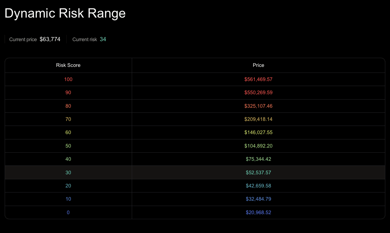
How to read the table
The table displays estimated prices for Risk levels from 0 to 100 in 10-point increments.
- Lower rows represent currently estimated prices associated with lower Risk Metric levels.
- Middle rows represent more neutral Risk Metric levels.
- Higher rows represent currently estimated prices associated with higher Risk Metric levels.
- The highlighted row shows the range containing the current Risk Metric.
Each adjacent pair of rows forms an estimated price range for a 10-point Risk band.
For example, the prices shown beside Risk 40 and Risk 50 represent the current estimated lower and upper price boundaries for the 40–50 Risk band.
How to use it
Dynamic Risk Range can help you:
- Understand the current relationship between price and the Risk Metric
- Compare nearby Risk bands
- Add price context when configuring a Risk Stop
- Plan informational risk alerts
- Review how the model's price mapping changes over time
Treat every displayed value as an estimate, not as a target or prediction.
Risk Stop example
Suppose an Adaptive Accumulation plan uses a Risk Stop of 70.
The plan remains eligible when the live Risk Metric is 70 or below and becomes ineligible when the live Risk Metric rises above 70.
The price displayed beside Risk 70 provides current model context for that threshold. It does not create a fixed price trigger.
A purchase may pause above or below the displayed price because:
- Momentum and volatility conditions may change
- The long-term trend may change
- Recent Risk Metric history may change
- New price data may move the estimated mapping
- Risk Stop evaluates the live Risk Metric rather than price alone
How Hodly estimates Risk–Price levels
Conceptually:
where:
- r is the target Risk Metric level
- Current market context represents the latest model inputs
- Recent Risk history provides the current normalization context
- Asset parameters represent model configuration for the selected asset
Hodly calculates estimated price boundaries for successive Risk levels and groups them into 10-point bands.
The exact inversion formula, transformations, compression rules, parameters, and lookback periods are proprietary.
Why the mapping changes
Risk–Price levels are dynamic because price is not the only model input.
Two observations with the same asset price can produce different Risk Metric values when momentum, volatility, trend, or historical context differs.
As new data enters the model, the estimated price associated with each Risk level may move.
Access
The full Dynamic Risk Range requires Core or Pro access.
Availability also depends on supported asset data and a current Risk Metric model snapshot.
Important notes
- Displayed prices are model estimates, not observed historical averages.
- Values are not price targets, forecasts, support levels, or resistance levels.
- A lower estimated Risk level does not mean an asset is safe.
- A higher estimated Risk level does not guarantee a price decline.
- The mapping may change without the asset reaching a displayed price.
- Risk Stop decisions use the live Risk Metric, not a fixed table price.
- Missing, delayed, unavailable, or corrected data may affect the table.
- Dynamic Risk Range is educational and is not financial advice.