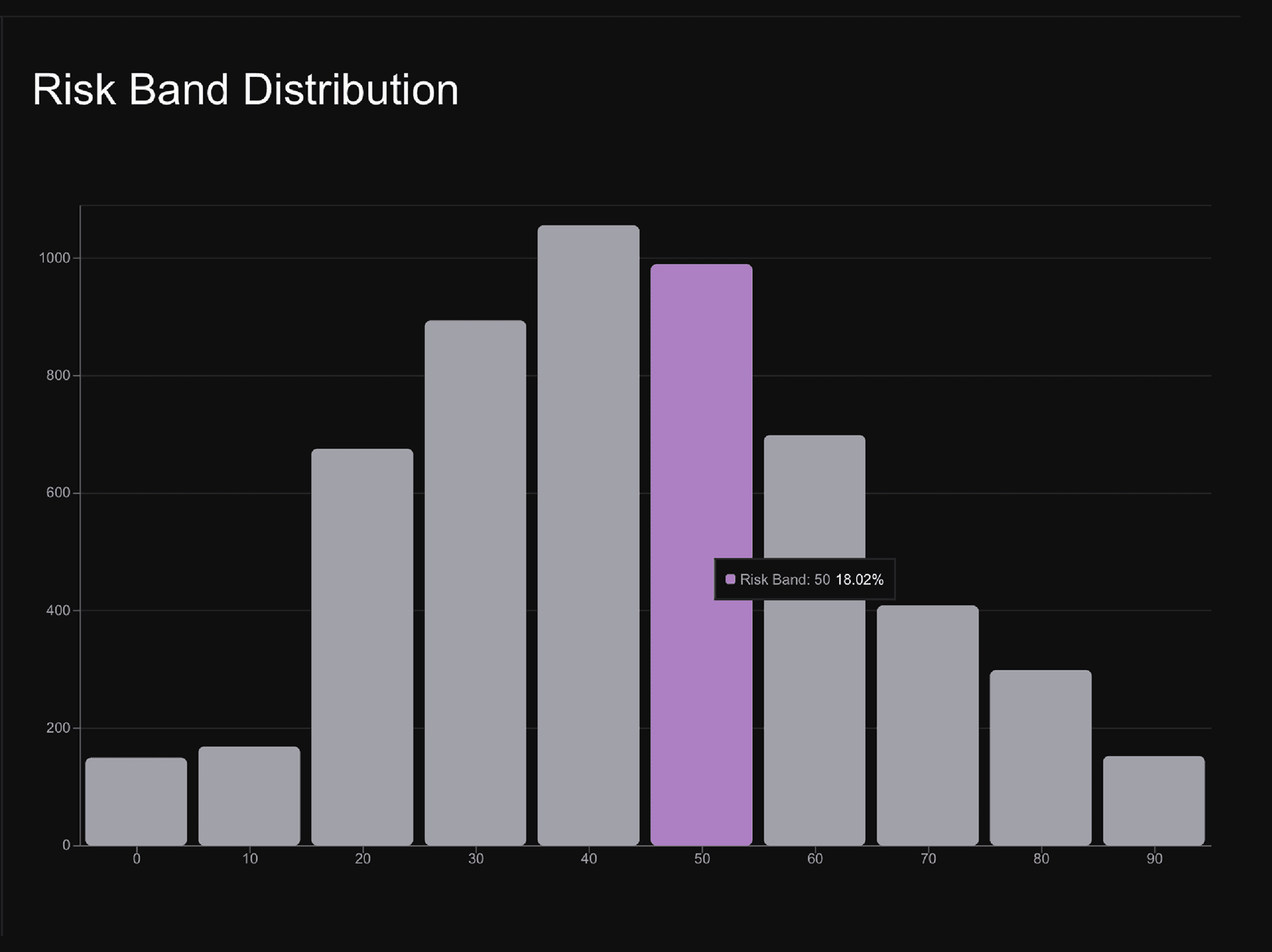
Risk Band Distribution shows how often an asset has traded in each risk zone over time. Each bar represents a risk level. A taller bar means the asset has historically spent more time in that zone. A shorter bar means that zone has been less common. Use it to see whether the current market is in a common risk area or a rarer low/high-risk area.
How to use the Risk Band Distribution?
Start by finding the current risk level, then compare it with the distribution.
- Lower risk zones show cooler historical conditions, where accumulation may have been more attractive.
- Middle risk zones show the asset's more typical trading environment.
- Higher risk zones show hotter historical conditions, where the market may have been more stretched.
This chart helps you understand how common or rare today's risk level is compared with the asset's own history.